What do McDonald’s, Frank Lloyd Wright and The Jetsons have in common? Plug them into Google and you might be surprised to learn that there’s a major connection. The answer is Googie Architecture.
“Googie?” I hear you ask. Was that a typo? Even those well-versed in design history might give you a puzzled look. But one of the most recognizable symbols on the planet—the McDonald’s logo—was born out of this kitsch, playful and futuristic period not serious enough to be considered “real” architecture.
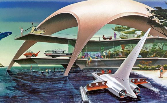
It’s the 1950s: America is optimistic and anything seems possible. The austerity of the depression has lifted and a new world of air-conditioning, fast cars and space travel has replaced it. Technology was erasing seasons, time and distance, and Googie Architecture was a response to this new world.
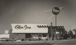
 Googie buildings featured upswept roofs, curves, geometric shapes and generous use of glass, steel and neon. Designs symbolic of motion, such as boomerangs, flying saucers, and atoms, represented American society’s fascination with Space Age themes and emphasis on futuristic designs.
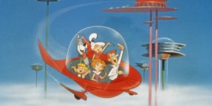
Googie was The Jetsons in real life.
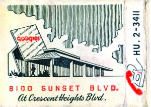
The term Googie was derived from a West Hollywood coffee shop called Googies that was designed by John Lautner, a student of legendary architect Frank Lloyd Wright. Architecture critic Douglas Haskell used “Googie” to describe the architectural movement, after driving by the coffee shop and finally feeling like he had found a name for this style he was seeing.
Googie was like modernism at Mardi Gras, or the love child of Coco Chanel and Jenny Kee.
The baby boom of the 1950s created a rush to the suburbs—leaving a trail of urban sprawl behind. The car was now king. This change in the way people were living created a new problem for consumers, of long commutes into congested cities, that demanded a solution. Hence, the Strip Mall was born. An ultra-convenient shopping experience where you could drive your car right to the door of the shop, cinema or restaurant. This new approach to shopping brought with it a new set of design problems to solve.
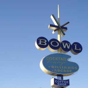 Taking ideas from modernism—where form followed function—Googie buildings took on an additional role where the function was advertising. A playful, optimistic slap in the face “I’m here” kind of function with colored, flashing, illuminated and revolving signs; it was a dense graphic corridor of consumerism. They weren’t just buildings—they were billboards too!
As Googie expert Alan Hess describes in his book:
The strip environment was as thoroughly shaped to the requirements of car transportation as the piazzas of Italy responded to the needs of the pedestrian. There—open air markets and sidewalk cafes were scaled to the walker.
The strip was scaled to the proportions of a person traveling in a car at 30 or 40 mph with a number of distractions.
The rooflines and signs were visible from a distance, the building evolved and increased in detail as the customer approached by car, then foot. Everything was designed in response to this, right down to the door handle.
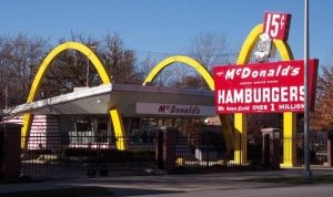
This response to the car culture is also responsible for the foundations of the world’s most recognizable logo and symbol of American culture: McDonald’s. After operating a single outlet for many years, the McDonald brothers asked architect Stanley Meston to create their first franchised outlet in 1952.
They wanted a design that was bold enough to grab the attention of drivers along the cluttered commercial strips, and include an idea that Richard McDonald thought up one night—two giant arches. The final design was developed in classic Googie style and included two large arches at either end of the building that, when viewed from an angle, formed a letter M.
The buildings were highly recognisable and a huge success. The footings of a global franchise had been laid. In 1961 the ‘M’ icon of the distinctive architecture was incorporated into a new logo.
My formal design education swept over this period of design history—focusing on the classics—the Bauhaus and the international style. But the hyper-kitsch style of Googie architecture and the graphics that surrounded it have had a massive influence on our graphic history.
From the much-maligned starburst to the crazy elements hanging in midair, cursive scripts combined with sans serifs, bubbling circles, unexpected angles creating a feeling of spontaneity, energy, and tension, dingbats, sparkles and neon created a vernacular that is still viewed with a fondness by many designers today.
RELATED VIDEO


Share this Post
latest post
-
 Helpful October 4, 2022
 -
 FAQ October 4, 2022
 -
 Reference Guide October 4, 2022
 -
 Guidebook October 4, 2022
 -
 Reference Book September 1, 2022
 -
 Manual September 1, 2022
 -
 Handbook September 1, 2022
 -
 Resources August 24, 2022
 -
 Software architecture and Design Patterns June 14, 2022