
 Is graphic design fun? That's a question my colleague was asked last year, and after intense discussion we decided that it's a strangely hard one to answer. The reason is that although it's rewarding and edifying, it also requires you to constantly evolve and start every project like you know nothing. Otherwise, you'll end up turning into a bitter old grump whose work looks exactly the same in twenty years.
I've compiled a list of signs that your design style has become dated, pulled from the trends of the past couple decades. Bear in mind that these are only symptoms, and most of us have been plagued by at least one of them. But if you check off everything on this list, it might be time to re-think the way you work.
1. Your Home Page Says "Hello. I make websites and other cool stuff."
You probably also have a contact button that says "Let's have a beer together." Now don't get me wrong: I like moving away from designer jargon, and I certainly am not opposed to beers. But the novelty of a designer who doesn't take themselves too seriously has begun to fade. People want quality, in addition to dealing with people who are decent humans. It shouldn't be celebrated as an added bonus that you're not a pompous douchebag. We expect practicioners of other vocations to be humble and competent. We're no different. So do a little courting before you plop your dirty feet up on your client's table.
2. You Have Not Used Any Typography Created in the Last Ten Years.
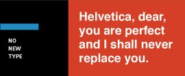 Designers should be curious by nature and aware of current trends. If you fit this mold, you are likely to have found at least a handful of nice typefaces in the last decade. If your name is Massimo Vignelli, then you might get a pass on this. Otherwise, you're either not experimenting enough (also known as being lazy) or you're of the hyper-principled mold and would prefer that the type just carry the message, not speak it. The latter is fine, but I bet it will get old after a few years.
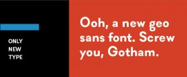
3. You Have Only Used Typography Created in the Last Ten Years.
There is a reason why the classics are classics. If you are only using the next trendy typeface, and do not tap into the vast pool of typography that's existed for hundreds of years, chances are your design doesn't have any staying power. There is no cause-effect here: using exclusively new typefaces doesn't render your work dated. Rather, studying design history and analyzing the works that have remained timeless is something that designers must do. As the history of design as we know it is inextricably tied to moveable type, the faces that have remained in the fold for hundreds of years are surely important. Their DNA, rearranged and combined, makes up nearly all new text faces that are released. It's worth giving the originals a whirl, especially since they're so accessible.
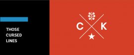
4. There is an Arbitrary Pair of Crossed Lines in Your Latest Logo Design.
 Here's the odd thing about the whole hipster logo trend (a term which I realize has lost most of its meaning at this point): some of the core tenets of the Hipster Logo Manifesto are sound. Simplicity, check. Adaptabability, check. Attractiveness, check. But they still fail to accomplish the goal of a logo, which is to identify. It's hard to identify anything if everything looks the same, which means nothing is memorable. The reason this happens, I suspect, is that most of the people creating these marks are either not schooled in how to extract the essence of a company and develop it through blue-collar tenacity, or they just choose to skip this and make something pretty.
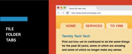
5. You're Using File Folder Tabs in Your Web Navigation.
Is this 2015 or 1995? There was a time when it was cool to create organizational structure on the web that resembled tangible items, like tabs and folders and folding books. But we've all gotten the point now that this can be done digitally, so it's just not that cool anymore. There are plenty of mind-blowing techniques that more naturally suit the web, and which can't be done in real life. Let's celebrate those in the virtual world, and keep reading our musty old paper backs on the couch.
6. You Have a Photograph on Your Business Card.
This may be possible to pull off. I've just never seen it done. It's not only dated, but super unprofessional. And it's really a no-win situation that you're putting yourself in. If you're goofy looking, then people will say "I don't wanna buy my insurance from this goofy-looking fella." If you're attractive and do the same, then people will say "I'm not gonna buy my insurance from this smug fella." The folks whose business you really want are more concerned about what you do, not what you look like. Besides, how will you decide what typeface pairs up well with your features?
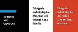
7. You Use Drop Shadows or Gradients on Type. (Or Both.)
Generally speaking, gradients and drop shadows are best left for sports or waterparks. This is one of those "just because you can doesn't mean you should" sort of things. Yes, gradients and superfluous drop shadows often look silly and unnecessary. But it's not just out of principle that I caution against this. In many cases, it is objectively bad to add a shadow to your text, particularly if you're using dark text on a light background. All that shadow does is muddy up the legibility of your words. With type, you need contrast, and a fuzzy halo around your words mutes that contrast. You can certainly use shadows well, as long as they're not a crutch, but your design should work without them, with the gradients simply adding a touch more depth. For example, a subtle and abrupt shadow behind light text can help it stand out on a dark background. Just keep your gradients in large chunks of space, and never in body copy.

RELATED VIDEO


RELATED FACTS
-
 In computer engineering, a logic family may refer to one of two related concepts. A logic family of monolithic digital integrated circuit devices is a group of electronic logic gates constructed using one of several different designs, usually with compatible logic...
Share this Post
latest post
-
 Helpful October 4, 2022
 -
 FAQ October 4, 2022
 -
 Reference Guide October 4, 2022
 -
 Guidebook October 4, 2022
 -
 Reference Book September 1, 2022
 -
 Manual September 1, 2022
 -
 Handbook September 1, 2022
 -
 Resources August 24, 2022
 -
 Software architecture and Design Patterns June 14, 2022